Rebranding: The Voice of Getsafe
An Introduction to Our New Tone of Voice
In the beginning of May, Getsafe launched their new improved corporate identity. Logo, fonts, imagery, and colours let the company shine in new splendour. What stands out? The design goes hand in hand with a novel, powerful and positive tone. In this article, we want to focus on our new tone of voice, how it was developed, and what its major differentiators are.
What Is the Tone of Voice ?
The personality of a brand is not only defined by what it looks like. How it behaves and how it sounds also play an elementary role. The tone of voice therefore describes how Getsafe sounds as a brand: self-confident but down-to-earth, approachable and professional, realistically optimistic and encouraging. Depending on who you are talking to, the elements of the tone of voice are emphasised to different degrees. Always hitting the right tone, maintaining consistency in communication, and at the same time conveying the personality of the brand is a tightrope walk that requires a lot of sensitivity and empathy.
What is our tone of voice? How can it be applied to customer-oriented communication on the website and in the app? How can we ensure consistent communication? These are the basic questions I have been dealing with as a product copywriter for Getsafe during the rebranding process.
Becoming Who We Are – Developing Our Tone of Voice
We’ve always known what we wanted to say. It was always clear to us who we were. The rebranding process was all about finding the best possible way to express that. In the process, we identified three behaviours that now form the basis of our brand strategy and thus of our entire communication. These relate to three areas in which our tone of voice plays a key role:
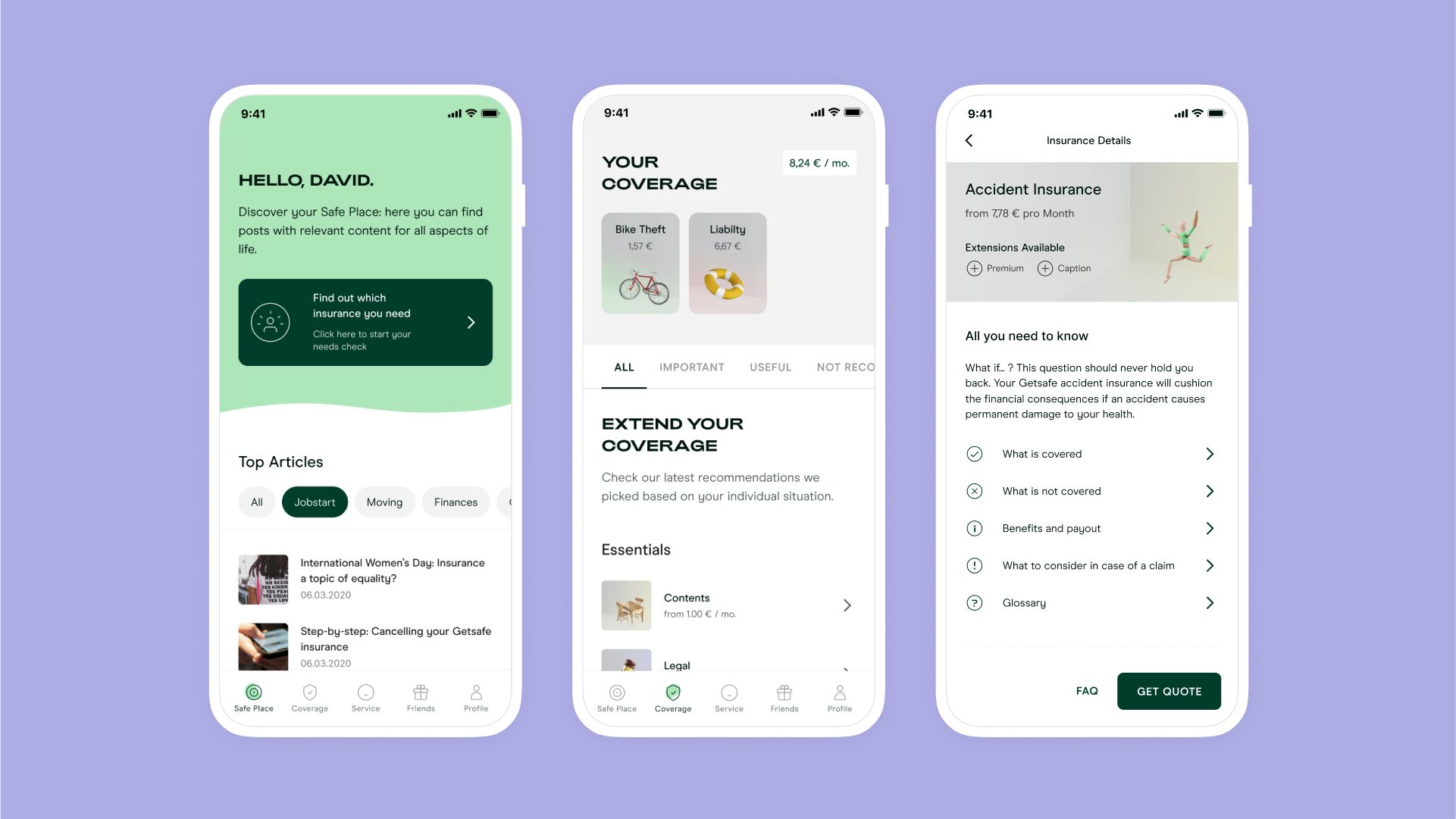
Communication around our app and insurance
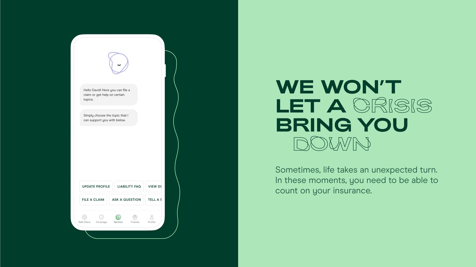
Dealing with crises
Marketing communication
Typography: Design and Language Go Hand in Hand
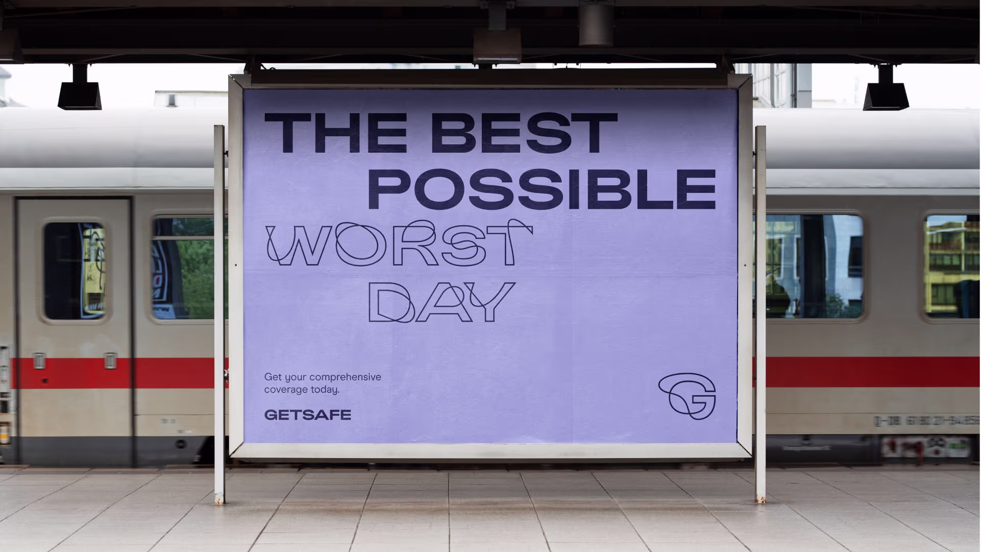
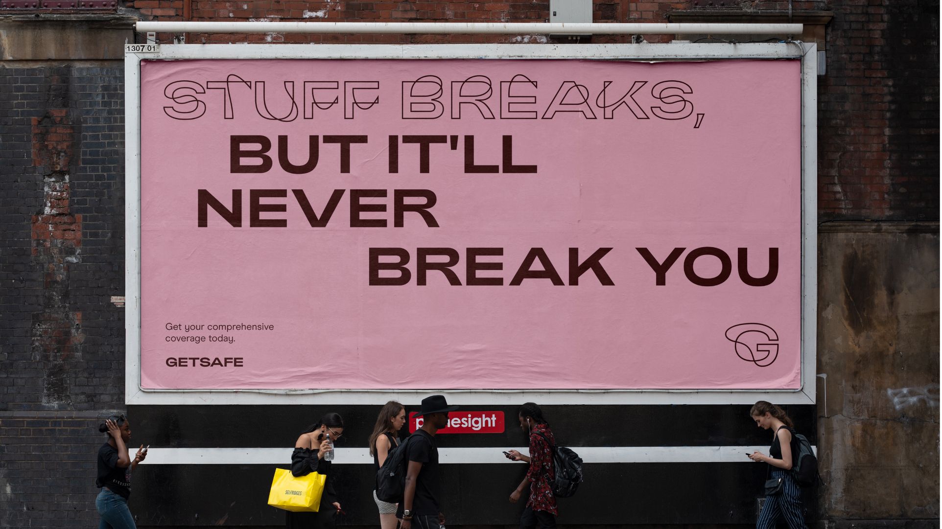
The fact that our language is an important component of the new brand can be seen in one central element: typography. With a typeface developed especially for us, we clearly emphasise the balancing act between crisis and a positive attitude towards life. The new typeface is a form of the font Adieu that includes “accidental” elements. This is only used for negative words and situations. However, it never stands alone, but always together with the unblemished Adieu – representative of the positive side both visually and literally. This is our way of showing that we make the best out of every crisis.

The Essence: Our Vision
In this phase of self-discovery, one thing has become particularly clear to us: We want to support our customers in this process and enable them to lead a free and self-determined life. This deep conviction and our new tone of voice come together in one strong vision:
“We empower people to live life to the fullest by covering them and their universe, no matter who and where they are.”

Adieu, Fear. Hello, Life.
But what makes Getsafe different from other insurance companies? What we now bring across with our tone of voice, we’ve been showing within our product all along. We are modern, empathetic, and positive. We bring together what belongs together: technology and humanity. Security and freedom.
Insurance should not play on people's fears. Other insurers focus on stirring up their customers' fear in order to supposedly alleviate it with their products. This is an approach that has never really made sense to us. It’s a strategy that has never been adopted in other industries either. (Or are we seeing food manufacturers using "hunger" as their best sales argument? No, when you think of food, you think of pleasure).
Therefore, with our new brand we bid farewell to fear not only symbolically. We write it in big letters on our website: ADIEU, FEAR. HELLO, LIFE.
We’re convinced that thanks to Getsafe, a great change in the perception of insurance is just beginning. To think of Getsafe is to think of empowerment.
You might also like: